Category Archives: Website

Open Source, Open Community

A brief story of sharing educational resources

In the software community, the Open Source movement encourages sharing software freely. Whether it’s “free of charge” (one type of freedom) or “free to use these materials and modify in any way you wish” (a different type of freedom altogether), these people share the work they’ve done and the rights to use their work with the larger community.

In the education community, too, there is a long history of teachers sharing resources with each other. From worksheets to lessons plans, from presentations to assessments, we have all benefitted from the experiences and work of our peers at one time or another.

In my own teaching career I have moved from being a borrower of others’ materials to a creator of my own. Computer programming assignments from Cindi Mitchell, physics lesson plans from Dennis Wittwer, Don Hubbard, and Carol Wawrukiewicz, and pedagogical strategies from Aaron Glimme have all informed what I teach and how I teach. A few years into my career I began developing the confidence to share my own growing expertise with others, and learning how to publish my own materials on the World Wide Web was a turning point. Since then, I’ve been happy to share much of what I do professionally on my course websites, even as my own practice continues to evolve.

For a number of years now, teachers at Poly have been using the school’s internal website, MyPoly, to help organize and manage resources for their students. Some teachers also maintain public-facing websites where that information is available to others outside our community. (See Greg Feldmeth and Craig Fletcher” for examples.) These websites typically don’t share everything a teacher does—test keys and personal student information wouldn’t be appropriate for posting-—but assignments, practice materials, and even homework solutions might be found.

It’s not unusual for a teacher who shares materials to receive emails like this:

Hello Mr. White!

I’m teaching AP Physics 1 for the first time at Crescent Valley High School, in Corvallis, Oregon.

I came across your website while searching for materials to use for a pre-assessment.

Would it be all right with you if I include some of your questions in the document I give to my students? I’d be happy to return the favor at some point if it’s ever useful.

Thanks in advance and I hope the new year is treating you well.

Take care,

DB Science Department Crescent Valley High School

Occasionally a student will write asking for assistance of one kind or another. I received one such request from a student in Maryland just after the Thanksgiving Holiday in November, 2018.

Hello Mr. White,

My name is Zeke Nohr, a senior at Aberdeen High School. Over the brief Thanksgiving break, our physics teacher resigned very unexpectedly. The school in the process of finding a replacement for him but as of now, me and 5 other seniors who are very skilled and interested in physics have been placed in charge of planning the curriculum for his physics classes. Two of the classes are AP Physics C: Mechanics which we all took last year so we have all the resources we need for that. The other two are AP Physics C: E & M which we are currently enrolled in. We have some resources that our teacher left behind but we are missing practice tests we would like to use as review materials, especially since we plan on having our next test on Monday or Wednesday next week. Our previous physics teacher frequently used the “Multiple-Choice Practice Problems” from your website, learnapphysics.com, that are displayed with all units. I do not see a way to download these as a document to distributed to our class. If you have those documents available for the Electricity and Magnetism Units, we would be extremely grateful if you could provide us with a copy.

Best Wishes,

Zeke Nohr

I replied, with instructions on how the student could access some of those problems, and provided links to some practice tests that I post online for students, and got a quick reply.

Hello Mr. White,

Thank you so much for taking time to respond to my email and providing me and my fellow students with resources we can use for the rest of the year in our physics class. We are extremely grateful for your help during this transition.

Thank you,

Zeke Nohr

When I shared the story with Craig Fletcher, he thought that he might have some materials that the students would benefit from as well. In a separate email, he sent along his own set of links.

We didn’t think much more of it until we each received an email the day before Winter Break:

Dear Mr. White and Mr. Fletcher,

Hello, this is Zeke Nohr from Aberdeen High School. I sent you an email around the end of November asking for practice tests resources for our physics classes that me and two other students were teaching due to the unexpected departure of our physics teacher. Mr. White first sent me some great practice tests which were extremely helpful and we are all very thankful for your generosity. When Mr. Fletcher sent me the email saying the two of you had discussed it and shared the plethora of resources on your website, including lectures, textbook links, practice tests, and homework problems and solutions, we were all surprised and excited by your generosity and willingness to help us through a difficult time. Luckily, a new physics teacher was found very quickly and he started here on Monday. His name is Viktor Polyak and he recently graduated from college and this is his first time teaching. He is very good at explaining the topics and all of us here at the school like him. Since he is a first time teacher, he didn’t have any teaching resources when he came in so we have been using the lectures that the two of you supplied and they have been so informative and helpful to us (the mechanics classes have especially enjoyed “The Island Series” at the beginning of Mr. Fletcher’s lectures) and we intend to keep using them for the rest of the year. Having these resources has made the transition to a new teacher so much easier as he does not have to spend time looking for lectures and homework problems and can focus on helping us learn. We are all extremely grateful to the two of you for sharing your resources with us in a time when we did not have access to any. Your generosity and compassion is heartwarming and has made a huge impact on us here. I told the other students here that I was sending a thank you email today and some of them wanted to sign the email as well to show their gratitude.

Thank you so much,

The email was signed with the names of 42 students, the school’s program director, and the new physics instructor, Victor Polyak.

Teachers at Polytechnic School find lots of ways to become involved in our community of learning. We are involved with consortiums and cohort groups, we attend workshops and conferences, we teach at summer school or Partnership for Success!, and we work with teaching fellows and mentor new teachers. For me, making course materials I’ve developed available online where they can serendipitously benefit students and teachers in an even broader community has been a rewarding part of my professional life.
Sherlocked!

Well, I suppose it had to happen sooner or later…

I’ve been Sherlocked.

If you’re not familiar with the term “sherlocked,” it comes to us courtesy of Apple, which back in the day offered a file search capability on its OS called “Sherlock.” The original feature set of that capability was expanded upon by a third-party developer who crated a software tool “Watson” that served as a companion to Sherlock, with the ability to search the Internet, perform calculations, look up references, etc. It was such a useful tool that Apple, in a subsequent release of the OS, incorporated almost all of those same features into their software. The developer was no longer able to make any money off the software he had developed–he had been “Sherlocked.”

This wan’t the first time that such a thing had happened. The first case of this happening that I’m aware of is back in the early Macintosh days (System 7), when Steve Christensen’s SuperClock! utility was written to allow the computer to display the time in the upper corner of the screen. This eminently useful feature was incorporated into System 7.5, along with a number of other features adapted / adopted/ stolen from other software developers. A lot of people view this as simply the cost of doing business with a large, powerful organization, but it seems like a bitter pill for a hard-working developer to have to swallow.

You can learn more about the process of being Sherlocked by Apple at:

What does this have to do with me?

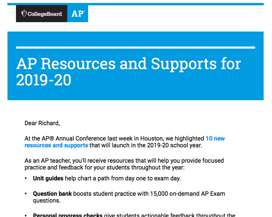
A couple of days ago, I received an email from the College Board announcing some new features that were being added to the College Board website.

That “Question Bank” that supports students with 15,000 on-demand questions? That’s my idea! That’s exactly what the learnapphysics.com website has been doing for the last ten years.

Okay, to be fair, people have been publishing banks of test questions for years, and the SAT “Question of the Day” was a thing that I took as inspiration for my website, so… I can’t complain too loudly here. In fact, I’m not complaining at all. I’m glad that the College Board has caught on to the idea that there are lots of ways that they can support students taking their courses.

But if anybody asks, I’m going to come right out and say it: “Yeah. I got Sherlocked by the College Board.”

Looking Back

Looking Back

by Richard White

2016-03-05

Those of us who use technology, who teach with technology, and who think about technology and its influence on society, enjoy thinking about what’s coming, what might happen in the future.

It’s interesting to take a look back every once in a while to see where we’ve come from. I’ve got a Motorola RAZR sitting in the bottom of a drawer in my utility closet. I’ve got a 1990 Macintosh Classic sitting in the attic, a 2001 Titanium PowerBook G4 in my utility closet, and a 2004 PowerMac G5 Dual Processor sitting underneath my desk at school, all currently unused. (I’ve had many other machines over the years, but these were iconic, and I keep them around for sentimental reasons.)

powermacg5_2cpus_open-100043320-orig

I’ve got a box of floppies with files of mine that I can’t use anymore, EXCEPT on that Classic, because the software companies that created those files, market leaders at the time, went out of business a long, long time ago.

designing_web_usability

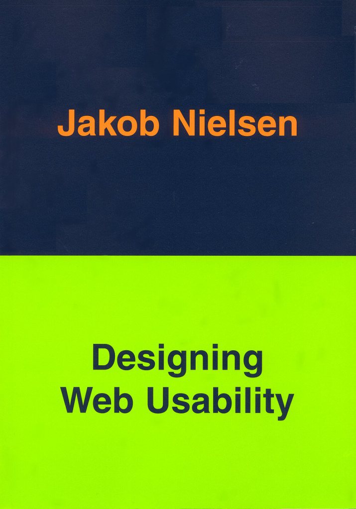
I also recently stumbled upon a book of mine from 1999, Jakob Nielsen’s seminal Designing Web Usability. As a fledgling designer at the time—some might consider me still a fledgling designer—I devoured that book as gospel.

designing_web_usability_notes

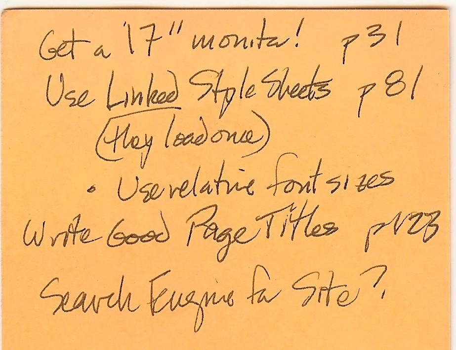
I found some marginalia for that book that I’d jotted down on a Post-it. At the time, a 17-inch monitor was considered an outrageous extravagance, but Nielsen considered it an investment in one’s productivity, and I made a note to myself to get one. Cascading Style Sheets were new to me, and I jotted down a reminder to create a .css file for the websites I was developing.

It’s almost cute!

Things have changed since then, of course, to the extent that I sometimes question whether or not something as quaint as a printed book can usefully advise on something as dynamic as the World Wide Web. Since Designing Web Usability came out, the number of people using the web has (obviously) exploded: approximately 41% of Americans used the Internet in 1999, compared with 87% in 2014 (Pew Research Center). In 1999, the primary means of accessing the Internet now (smartphones), didn’t even exist. Since the book was published, advertising has changed the way we surf twice, with the appearance of Google’s “AdSense” in 2000, and with the increasing popularity of adblockers in 2015.

The fact that this book is no longer useful is in no way a criticism of its content. At the time it was perfectly relevant, and the web was evolving at a relatively slow rate.

And now? Now, our browser software is updated more frequently than most websites, and books about the current state of the our technological culture, for good or for bad, are in danger of becoming outdated between the time they’re written and the time they’re published. Books produced in smaller batches by smaller, digital-based publishers (see TakeControlBooks.com, for instance) have stepped in to fill some people’s need for printed matter.

But the logical conclusion to all of this seems to be consuming content on the machine or in the browser itself, no? From man pages in the Terminal to FAQ pages on websites, increasingly we learn about how to do thing from the very device that we’re working on. That seems reasonably clear at this point.

Just as with my old computers, I feel affection for my old books. There’s a texture to the pages, and a smell, and an experience, that a monitor, touchscreen or smartphone will never replace. (I gave a candle with the scent of “old books” to a friend for Christmas this year.)

And yet, the vast majority of those old books now occupy the same space in my life as the old technology: I think of them fondly, and take them out to look at once in awhile, but mostly I store them tucked away in a space in my life where they sit, remembered but unused.

Gettin’ all Responsive

Gettin’ all Responsive

Richard White

2015-08-26

One of my projects this past summer was to convert most of the websites that I have to a *responsive* design: a single HTML file, with it’s accompanying CSS, will format the content of the webpage in a manner befitting the dimensions of the browser window that’s viewing it.

The browser window dimensions are part of the story, but the real reason you want to do this is to accommodate the different types of devices that people are using to view your site on. Increasingly, tablets and phones are responsible for a surprising amount of web traffic, and the responsible web designer wants to satisfy those visitor with content that is easy to view.

Is this a thing?

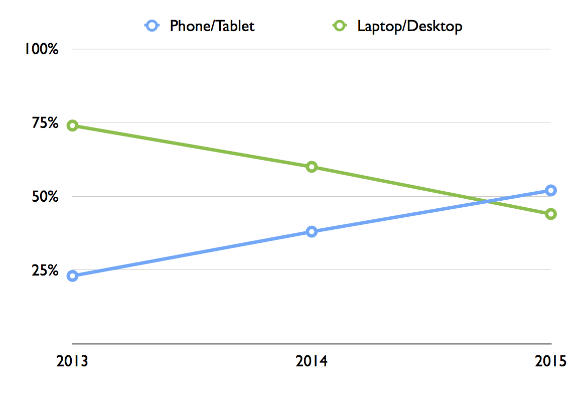
How much traffic is mobile-based? Well, here are the results published by Jon Gruber of Daring Fireball for visitors to his own site.

most-important-mobile-vs-pc

For my own LearnAPphysics.com, 68% of my visitors still come in using a desktop browser of sorts, but that means almost a third of them are using a tablet or phone of some sort. It’s in my interest to make their experience a good one.

How do you make a site responsive?

The technical solution to making a website responsive is simply to include some additional code in a CSS file that describes how different `div`s on the site should behave under different conditions. Perhaps the `header` div will be left-justified on the wide screen of a desktop browser window, but that same `div` will be centered in the smaller width of a cellphone screen. A graphic that fits nicely onto the landscape view of a desktop might not appear at all in the cellphone version of that same window. All of these options are defined by the CSS file.

How do you design a responsive website?

Well that’s the real trick, isn’t it? This HybridClassroom.com website uses a WordPress template that I’ve selected, and there’s a simple interface that allows one to enter text in, and that text then is populated in the fields of the template. I don’t have to do much work beyond writing the text itself.

But the template itself isn’t responsive. WordPress almost certainly *makes* a responsive template that I could use for this site, but I haven’t yet found it and installed it here. Maybe I’ll do that after I get done writing this blog post. ;)

If you’re “rolling your own” website—highly recommended if you have any inclination at all—then you have the power to design your site however you wish, and you already know that design is an incredibly deep and complex topic. But maybe you’ve been doing that, and you’re ready to jump into trying to adapt your design so that it will work on a mobile device?

You could, but it’s far easier to follow Google’s advice and create a new webpage from scratch, in a “mobile-first” vertical design that leverages a smartphone’s portrait mode. Once you’ve done that, you can rearrange the pieces to fit a more standard landscape desktop browser model.

That’s exactly what I ended up doing with most of my websites, and I’ve been very pleased with the results. You can check out the work at LearnAPphysics.com or crashwhite.com/apcompsci. Load either site up in your desktop browser and try resizing the window until it is as small as it will go. You can also visit the sites on a smartphone and compare what you see there with what you see on your desktop machine.

Welcome back for another school year! And now, I’m off to find a responsive template for this website!

Whither Identity: Reclaiming your templated self

Whither Identity: Reclaiming your templated self

by Richard White

2014-10-05

Part III in the “Whither” series

Who owns your online data? Who owns the content that makes up the digital you? Is your digital identity locked into Facebook as a series of uploaded photos, status updates, and comments on others’ posts? Do you have a copy of your tweet timeline? If and when you decide to migrate from Facebook, will your digital identity travel with you?

Audrey Watters refers to the “templated self,” a digital “you” that is described and defined via the features and constraints of any given platform. As cyborganthropology points out, Facebook and Twitter are strongly templated, with structures are policies that are highly confining to interactions. WordPress and Google+ are less confining, but still require working within a templated (pre-structured) space. MySpace pages—to their own detriment—had much less in the way of structure (hence the obnoxious and hard-to-read backgrounds that some users delighted in presenting).

Creating one’s own website is the least restrictive platform of all, of course. User-created content is not shipped off to be stored in someone else’s silo, but is maintained and managed in one’s own domain.

How significant is this to you? Is your Digital Self hosted somewhere that’s “too big to fail?” “Software as a service” relies on a company maintaining support for that service. Some services/platforms that have gone away in the past year or two:

  • Google’s social networking service Orkut
  • Twitter’s image hosting service TwitPic
  • Video streaming service Justin.tv
  • Apple’s MobileMe shut down
  • Yahoo!Blog shut down
  • Everpix photo hosting service shut down
  • Google Wave shut down

It’s no surprise that businesses and product lines occasionally fail or are discontinued, and that possibility is especially prevalent in technology, with boom-bust cycles akin to a bucking bronco. It’s all the more important, then, to give serious thought to how much of one’s identify one wants to invest in an organization’s template.

Closer to home—in our classrooms—it’s also the case that educational platforms enforce templated identities. Learning Management Systems, almost by necessity, structure content and data in such a way that it makes it difficult to move that data around to other places. Even something has simple and local as a classroom wiki doesn’t typically provide much in the way of data portability. The online grading program that I use for tracking my own students’ progress provides an Export utility that creates a CSV-based backup file for instructors, but provides no such option for students. Data that goes in to these systems very rarely finds its way out.

Another educational feature, perhaps peripherally related to the templated self, is the Digital Portfolio, which purports to provide some means of collecting, storing, and presenting a students’ electronic information over a longer period of time. I understand the desire for such a record–I have both digital and non-digital portfolios of work that I’ve done, assignments in school, artistic pieces, etc.–and I think schools are wise to be considering ways to implement these collections. (My school is in the process of discussing these possibilities right now.) I have to wonder, however, at the wisdom of paying for a storage/presentation service that places student assignments in a proprietary silo, with access controlled by a business that may or may not be around five years from now. Are there significant advantages here over the simple and expedient solution of having students place their most important work in a network folder?

The Internet began with a decentralization of access; anyone could access information from anywhere on the network. If Facebook and WordPress have given us templates, and in so doing forced a proprietary, siloed, centralization of our data, Watters encourages us to consider a “re-decentralization of the Web.”

If you’re interested in having an honest, long-term, presence on the Internet, reclaim your self. Get your own domain. Be who you are, rather than a Facebook status update that may or may not actually be seen by your friends, depending on whether Facebook decides to show it to them.

The original promise of the Internet was a democratization of voice: everyone had access, and everyone could be heard. Increasingly, however, voices are siloed behind paywall, registrations requirements, and licensing agreements.

Register your own domain, at hover.com or any one of hundreds of other registrars.

Reclaim your voice.

Reclaim your identity.

The Intersection of Teaching, Learning, and Technology

At Laura Holmgren’s request, last spring I wrote what became the inaugural post at poly360.org, a blog for the independent school community in which I work.

I’m fortunate to work in a community where the topics covered in that post are actually part of ongoing, day-to-day discussions I get to have with other teachers and technologists.

I’m cross-posting the piece here.

The Intersection of Teaching, Learning, and Technology

Richard White – 360 Reflection

When I was nine years old I read Danny Dunn and the Homework Machine, a story in which Danny and his friends Joe and Irene program a computer to do their homework for them. At that time the personal computer was still a fantasy, but the possibility of being able to have a machine handle my academic chores–my learning–was absolutely intoxicating.

Fast-forward a few years: I’d gone from programming a mainframe in high school to majoring in Computer Science in college, and then from teaching computer programming in high school on IBM PCs (pre-Internet!) to teaching AP Physics in Berkeley. I’d re-discovered the book from my childhood–there’s my name on the inside, written in my mother’s neat cursive–and read again about Danny’s hard-earned lesson: that programming a computer is not a shortcut to learning. The last page of the book, though, opens up a new possibility:

“Danny had a strange, wild look in his eyes, and a faraway smile on his lips. ‘Listen–what about a teaching machine…?'”

I began investigating the possibilities of technology-enhanced programmed instruction. The learning process for an inspired student can be a pretty straightforward process: get exposed to something new, learn a little bit about it, and then use what you’ve learned to do something interesting. For some subjects, the process of presenting information and checking for understanding is ideally suited for a computer, and I wasn’t the only one who thought so. Programmed instruction in book form had existed for years, and computer-based math instructional methods were already being launched.

I was a month or so into developing my own programmed instruction when I began to realize that this system, whatever its benefits might be, also had the effect of isolating me from the very best part of my vocation: working with students to help them understand the world around them. Teaching content, exploring with students the process of interpreting content, and perhaps most importantly, learning to develop strategies for dealing with new and unexpected situations, all demand a dynamic, creative, process that is the very heart and soul of my work. There was no way for me to write this stuff down, to program it, to “classroom flip” this aspect of my work.

That hasn’t kept me from leveraging technology where appropriate. The vast majority of my current curricular materials are online–lessons, labs, homework help, and practice tests–and students across the U.S. and abroad use these materials as a guide in their own learning. I am part of a global learning and teaching community, using technology that is faster, cheaper, and better than ever. We are actively exploring new ways that we can use that technology to improve education.

But at the heart of it all–sometimes just barely visible behind the iPads and the laptops, the email and the tweets, the websites and the Massive Open Online Courses–are students and teachers, working together, just as we always have.

And there is nothing that will be able to replace that.

Responsive Design in the Hybrid Classroom

Responsive Design in the Hybrid Classroom
2013-04-23
by Richard White

What is Responsive Design?

There’s a recent development in website design called “responsive design,” which refers to the design of a site so that it can easily be viewed on just about any device, from a giant monitor to a laptop, and on down to a tablet (iPad or otherwise) and a smartphone (iPhone or otherwise).

Early strategies for developing for these different types of devices consisted of designing two or more completely different versions of a website, with development and maintenance costs doubled or tripled as a result. More recently, a more reasonable approach has arrived: create a single site, but use Cascading Style Sheets (CSS) to customize display formatting depending on the device. So the site design “responds” to the device it’s being viewed on, and adjusts itself accordingly. Responsive design in web development is still a bit more complicated than it was in the good old days when all anyone used was 800×600 pixel monitors, but the payoff is this: people who visit a site using a mobile device–and these devices account for an increasing share of a site’s traffic–are going to have a much better experience.

So what?

But you’re not a web designer. Why are we talking about responsive design?

Just as mobile phones and tablets have caused designers to re-think their coding practices, it’s clear that changes in our students and the ways they learn is an opportunity to reconsider how we design our courses.

This is on my mind a lot as I tackle the development and organization of a course that I haven’t taught before, AP Computer Science. The teacher of any course is typically responsible for creating at least some of the content delivered in a course, or at the very least curating content and designing instruction and assessment strategies around that content.

A small sampling of some issues we consider when assembling a course:

  • What content will be delivered?
    • Is content available in a textbook?
    • Do I need to create my own content?
  • How will content be delivered?
    • Auditory lectures?
    • Whiteboard
    • PowerPoint
    • website
    • screencasts
    • PDFs
  • What activities support learning?
    • Homework
    • In-class activities
    • Worksheets
    • Laboratory experience
    • In-class activity
    • On-line activity
    • Field trip
    • Movie
    • Outside reading
    • Review sessions
  • How is feedback given?
    • During in-class discussions
    • Written feedback on assignments
    • Email
    • Peer review
  • How is learning assessed?
    • Projects
    • Quizzes
    • Tests
    • Cumulative Exams
    • Presentations

If you’re an experienced teacher than you almost certainly have already attempted to use most or all of these at one point or another in your teaching, and you’ve probably got your go-to list of favorite strategies that you use. But it never hurts to reflect a little on our practice, and re-examine what we do, particularly when a new course, or a new grade being taught, or even the arrival of a new academic year gives us a bit of breathing room.

Two Examples

From my own experiences in the last year, here are two quick examples of how I’ve reconsidered my teaching.

In both my Computer Science course and my AP Physics course I’ve become more committed than ever to making complete solutions of problem sets available to students online. It’s true that there will be some students who take advantage of this to copy work, but it’s my belief that there are a greater number of students who use the solutions as intended, i.e. as a resource to assist when stuck on a problem. Online solutions provide students with the support they need to make progress when I’m not immediately available, and I’m not comfortable with the idea of withholding those tools from some students based on a fear that some others will misuse the tool.

A second example from the Computer Science course is an assignment format inspired by a handout from a Michigan State University course (CSE 231) that I happened to stumble onto at some point. I’d been struggling to find a way to clearly state my expectations on assignments, as well as provide sufficient structure for the assignment so that students would better understand the solution strategies available to them.

On the one hand, I hadn’t wanted to give away too much information in the assignment sheets I handed out to students. On the other hand, I didn’t want things to be so vague that they had absolutely no idea of where to begin. The format of the CSE 231 assignment handout was shocking in it’s clarity, and inspired this new version of my project handouts. It features:

  • an Overview of the assignments, with a clear indication of the point value and due date
  • a Background section including general information about the context of the assignment
  • Program Specifications with a more specific detail of what must be included in the final program
  • a Deliverables description, with information on how and where the assignment is to be turned in
  • Assignment Notes that offer hints or specific strategies that students can use to better understand what they should be doing
  • a Getting Started section that describes some of the basic steps that students can use to begin their project
  • a section entitled “Questions for you to consider (Not Hand In),” which gives students a few questions to consider if they’d like to extend their thinking regarding this project
  • a Sample Interactions section which shows actual output from a working version of the program, so that they have a better idea of at least one version of a solution to the problem posed

There are seven projects I assign over the course of the semester that get one of these sheets, and it has greatly improved my students ability to complete assignments. Students who need more support find that the sheet gives them solid start-up strategies, while students who want to explore some of the more creative aspects of an assignment are sooner able to get to the point where they can do that.

Before I began distributing these Project Descriptions, I had it in my head that giving students a “Sample Output” listing would somehow be “giving it away.” The reality turned out to be that without a clear indication of my expectations, students didn’t find the project “intriguing” or even “challenging.” It was just “confusing and frustrating.”

Lessons Learned

It’s clear that we all need to revisit our practice from time to time. Conversations with other departments, investigating new technologies, and working with new teachers or even student teachers can all provide insights into what we do, and can provide a jumping off point for conversation that openly consider changing what we do as circumstances warrant.

By incorporating a Responsive Design attitude towards our own teaching–adapting what we do according to new contexts–we become more dynamic and more effective teachers.

Housekeeping

HOUSEKEEPING

by Richard White

2011-07-29

It’s Housekeeping Day on the website.

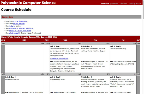
Like a lot of teachers, I have a website associated with each one of my classes, and over the course of a year, that website can get a little messy. Here’s the calendar that I used in the Fall, and there’s the results of that mid-year teacher/text/course evaluation that I posted (I’m a big believer in transparency). Here’s a picture of the class from the beginning of the year, and there’s a video of all of my students trying to squeeze into one cubic meter of volume (they didn’t make it, but it sure was fun trying).

I’ve got to clean all that stuff out and get things ready for the new school year.

There’s something else that I often do at this time of year, depending as always on time constraints. I was listening to website designer Paul Boag talk at one point about managing sites, and he said something that I thought was quite profound: “Many websites have someone responsible for adding new content to the site… but who’s responsible for taking away old content?”

Not all old content should be removed, of course, particularly if one of the site’s functions is to act as a repository of accumulated knowledge. But this isn’t necessary for the vast majority of sites, and certainly not for my class websites. This year’s students don’t want to be greeted with a photo of last year’s class when they log on, and the materials that I used last year may be markedly different from what I use this year.

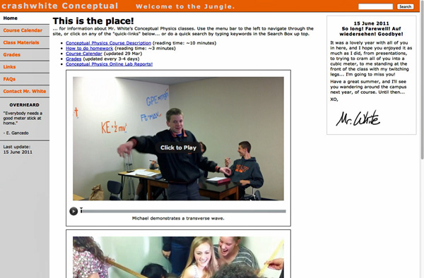
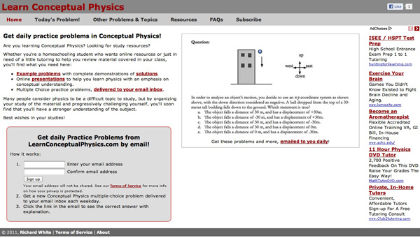
So it’s time to do a little cleaning, and a little pruning. (Below, see the homepage screencaps for three websites that I maintain for different groups of students I work with.)

It may even be the case that you want to look again at the design of your site. Ten years ago I was very pleased with what I felt was the optimal design of my site, until I spent an hour waiting in line at the movies with my friend Aaron doing usability studies with a pile of index cards that I’d prepared specially for the occasion. By the time we were admitted into the theater, I had a completely new perspective on how my site was viewed by someone woho wasn’t me, and the result was an enormous improvement in usability, as indicated by my students in subsequent interviews.

Switching between horizontal and vertical orientations on navigation menus can make a website feel completely different. Moving “Terms of Service” from a prominent location at the top to the barely noticeable footer at the bottom of the page is almost certainly a good idea. Switch from a fixed-width content area to a liquid layout (that resizes with the browser window)? Change themes? Colors? Rollovers? Remove graphics to make the page load faster? Add graphics to increase visual interest? Add a version of your website customized for an iPhone/Android experience, or at least make your website look okay on a mobile screen?

The possibilities for tweaking are endless, which is what makes designing for the web so fun, and so challenging.

I’m not sure I’m going to redesign my website today—that process typically takes a few days, and lots of chatting with people to find out what they like and don’t like. Today, I think I’ll just clean out the old content. That’ll take an hour or two all by itself.

August is almost here—is it time to start thinking about school yet?! ;)

How-To: Password Protecting a Website Directory with .htaccess

How-To: Password Protecting a Website Directory with .htaccess

by Richard White

2011-07-19

A friend of mine who maintains a website for his classes recently asked me how to go about creating a password-protected folder for the site. He wants to store materials on there that would be accessible to his students who would use a Name and Password to browse the folder.

In other words, when a user tries to go to a certain location on this teacher’s website, he wants them to have to authenticate with a Name and Password before they’ll be allowed to enter the site.

Here’s how you password protect a folder, in three easy steps.

1. Create the folder that will store the protected material.

For our example, we’ll assume that my account on the webserver is called rwhite, and the website files are all stored in public_html. In that directory public_html, create a new directory “secretstuff”, which is where we’ll be storing our password-protected materials. This folder should have a permission of 755.

(There are lots of different ways to “create a folder”, depending on how you manipulate files on your server. You might ssh in to the server, you might use Dreamweaver or Coda, … If you’re not sure how to manipulate files and directories on your server, learn how to do that first and then come back here!)

So in terms of your websites directory structure, here’s what we have so far (your files and directories will look different from mine–the ones shown are for example only):

/
|---home/
    |---rwhite/
	|---logs/
        |---mail/
        |---public_ftp/
        |---public_html/
	    |---about.html
            |---index.html
            |---secretstuff/

2. Use a text editor to create a text file called “.htaccess” in the folder that you want to protect.

To keep unauthorized users from peeking inside the directory secretstuff, you’ll need to add two additional files to your website that will instruct the server under what conditions it should display the contents.

The first file is a text file called .htaccess that is stored in the secretstuff directory. Note that this filename doesn’t really have a name—it only has an extension (the eight letters after the period). That means that this file won’t show up in most directory listings unless you specifically tell your computer to list ALL files.

Use a text editor—Notepad, TextWrangler, BBEdit, TextMate, vi, emacs, nano, edit, whatever—to create the .htaccess file in the secretstuff directory. The file .htaccess should include these four lines:

AuthName "Secret Stuff"
AuthType Basic
AuthUserFile "/home/rwhite/.htpasswds/public_html/secretstuff/passwd"
Require valid-user

Be sure to save the file with the name .htaccess (including the period in front!). That file should have permissions 644.

What does all of that mean?

First of all, .htaccess is used by the Apache web server to do all sorts of things on your website, and you probably already have a few .htaccess files sprinkled here and there on your site—we don’t want to mess with those. This particular .htaccess file in the secretstuff directory is simply being used to control access to that directory.
The four lines in that file, in order, say:

  1. Display this name in the authentication dialog box.
  2. Use Basic http authentication.
  3. Find the file containing passwords at this location on the server (see step 3 below).
  4. Make sure user has been authenticated before giving them access to this folder.

The only really tricky part about this step is the location of the password file. Note that the .htpasswds directory listed here is NOT contained in /home/rwhite/public_html—placing that directory in a publicly-accessible folder is a security risk. Instead, the .htpasswds directory is contained in /home/rwhite, which is not accessible by a browser. That location IS accessible to Apache, however, which will look at that location to find out which users will provide what passwords in order to gain access to the protected folder.

So here’s what we’ve got now:

/
|---home/
    |---rwhite/
	|---logs/
        |---mail/
        |---public_ftp/
        |---public_html/
	    |---about.html
            |---index.html
            |---secretstuff/
		|---.htaccess

3. Use a text editor to create the text file called “passwd” that we’ll place in the .htpasswds directory.

As discussed above, the passwd file will be be located someplace where a browser can’t get to it. Here’s where we’re going to put it.

/
|---home/
    |---rwhite/
	|---.htpasswds
	    |---public_html
              	|----secretstuff
		    |---passwd
        |---logs/
        |---mail/
        |---publc_ftp/
	|---public_html/
            |---about.html
            |---index.html
	    |---secretstuff/
		|---.htaccess

Note that if you don’t already have a directory called .htpasswds, you’ll need to create it, and then nest inside it the public_html and secretstuff directories. (Although some tutorials will instruct you to place a single .htpasswd file in those location, creating a directory will give you more flexibility later on, should you choose to create additional .htaccess authentications.) The .htpasswds directory and those nested inside it should all have permissions of 644, as should the passwd file itself.

Now, what actually goes IN the passwd file? For our purposes, it’s going to consist of a single line: the Name, a colon, and then the Password that a user will need to get into the password-protected secretstuff directory.

Assuming we want to allow ImaStudent to access the directory using a password of 123456 (not a very good password, obviously), that one line in the file passwd will contain both of those pieces of information, and look like this:

ImaStudent:EdQXJLHVRhCFo

Whoa, whoa, whoa. Where did EdQXJLHVRhCFo come from? That doesn’t look like our password 123456 at all.

That’s because EdQXJLHVRhCFo is an htpasswd “hash” of 123456. Apache is so security-conscious that it doesn’t even want to know what your real password is—it only wants to store a “hash”, or one-way coded version, of that password. When a user enters their password into the authentication box, that hashed password (the EdQXJLHVRhCFo, converted from 123456) will be compared to the hashed version in your passwd file.

So how do you know what hash to include in your passwd file?

There are a few ways to do this. One way is to go to a website like this one and enter your password into the indicated field.

Or, if you wish to do it yourself on the computer, open up a Terminal and on the command line, type

$ htpasswd -ndb ImaStudent 123456

…and you’ll get a line that you can paste into your passwds file.

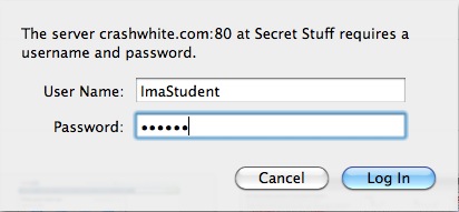
Once you’ve got everything put together, try going to the page that you’ve created and see if you can see anything. If all works as planned, you’ll be confronted by a dialog box that looks something like this.

By typing in the appropriate Name and Password, the browser should proceed to display the previously hidden contents of that folder!

There’s one more thing you may need to take care of, however, depending on how you want to use the new secretstuff folder. If you’re going to use it to serve up regular webpages like index.html then you’re all done: once a user’s attempt to access the directory is authenticated, those pages will appear just as in any other directory.

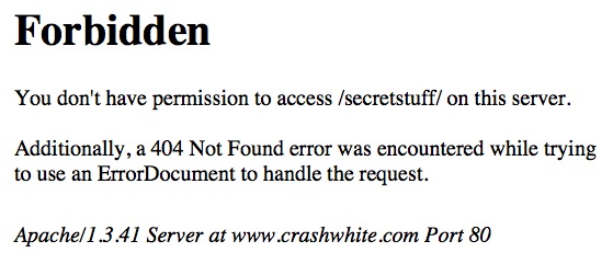
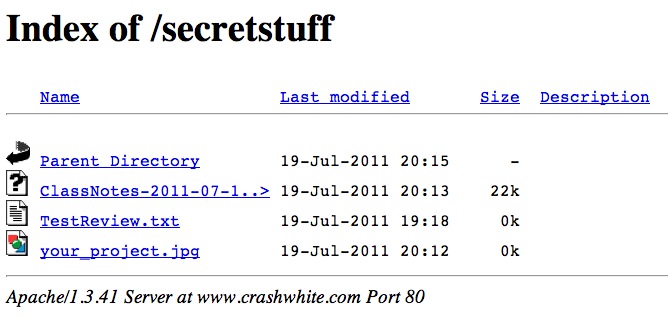
You may, however, wish to just dump a bunch of files into that folder that students can access. They might be text files, or Word documents, or graphics. If this is the case, it may also be that your webserver doesn’t by default allow these files to be “indexed,” or listed, and you’ll get an error message like the one above.

This is easily fixed. In your .htaccess file—the same one that we were working on in step 2 above—add a fifth line:

AuthName "Secret Stuff"
AuthType Basic
AuthUserFile "/home/rwhite/.htpasswds/public_html/secretstuff/passwd"
Require valid-user
Options +Indexes

This line will allow this directory’s contents to be Indexed, or listed, even if there aren’t any html files to be displayed.

Now students are able to view or download those files simply by clicking on them in the browser window.